Photos of home recording studios to give ideas for your own home studio set up.
 A description and comments about each home recording studio idea is located below the gallery identified by the name of each photo.
We picked some sample photos of different home or project recording studios to use as a reference for designing your own home studio.
In this article, we’re not looking at “the best recording studios” insofar as professional facilities that spend hundreds of thousands of dollars on acoustic treatment and studio design. These studio pictures are more appropriate for good looking project studios, and can be done for a reasonable amount of money.
Look around the recording studio section of POLITUSIC for more information about DIY acoustics, monitor placement, etc.
The assumption is that if you have enough money for a Neve, then you probably wouldn’t be looking here for studio set up ideas. Each of the studio pictures below in the gallery were selected for specific reasons listed below. The hope is that combined, they can give you some ideas for how you might want to design your own studio.
Below we say why each photo was selected (some good reasons, some bad). They’re referenced by the caption for each recording studio photo.
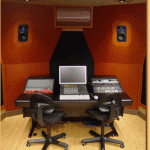
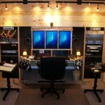
1. Studio Photo: Neat and Clean Pro Tools Studio. We know that not everyone can afford to buy a proper Argosy desk to hold your outboard gear and small audio console, or control surface – but you can see how that greatly helps with the presentation of the control room. (Plus making one on your own really isn’t that hard: it’s all about the finish and the trick to the finish is lots and lots of sanding after you apply two or three coats of clear semi-gloss.) We like this photo because of how clean it is – simple is good. Clean is good. It makes it look professional. There is a clear balance between analog and digital gear (the two racks have a fair amount of audio gear that can be put into the signal chain). If you own your space, then you can take it one step further and soffit mount your studio monitors as shown here. Building additional walls, angled, in the front of the room and leaving enough space to soffit mount the speakers. This gives a cleaner sound, but also significantly boost the presentation. Do this, and you can have clients in your home studio more than willing to pay a regular commercial studio rate (And it really isn’t that hard to do. Can get most of the framing done in a weekend.)
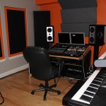
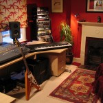
2. Studio Photo: Small space rack gear. This is a good set up for a long and narrow room. All the rack gear is in the desk with computer monitors on top and studio monitors to the sides (computer tucked away underneath most likely). Keyboard controller fits easily further back in the room. They bought acoustic treatment for the room (note how it’s heavier in front to prevent as many early reflections as possible, plus bass traps in the corners). It’s fairly clean and has a diversity of gear to get the jobs done. The colors, though… bit over the top. You want your studio to have character, but you don’t want to make it too annoying. Control rooms should be comfortable, not just trendy. Traditional, more timeless designs and colors are a better bet. Dark is always good, then you can use lighting to change the vibe as needed between recording, mixing, and client desires.
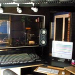
3. Studio Photo: Pro Tools w/ small console. This is an older example of working in a small space to build a control room. It’s a little bit tight. We’re getting to the point of a “less is more” situation, which is a problem a lot of home studios have. What’s good about this set up is that they managed to fit all of it into what looks like a walk-in closet. What’s bad is that the sweet spot for listening looks impossible to be in without leaning over sideways. Also, there’s overkill: you don’t need a console with that many inputs for a studio that size. Even if they’re treating it as a split console, I doubt that recording room can handle a session that requires that many inputs, and with the version of Pro Tools, it’s not going to do discrete outputs to mix on the console, anyway. Vocals in that space, overdubs for most instruments, great, but live band or a full drum kit where your spot mic’ing the whole thing…. small room = not so good sound. A bigger console isn’t always better. Also: the more you can avoid cheap Sonix foam panels the better. It looked cool in the 80’s but doesn’t to much to treat a room and looks… not good, honestly.
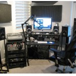
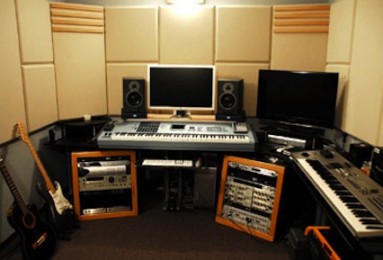
4. Studio Photo: Monitor Overkill. Stuff like this happens a lot when someon tries to set up a home recording studio. People who do set up a home studio tend to be gearheads, and gearheads like a lot of gear. That’s just the way the world works. My point is, though: less is often more, and more doesn’t mean better. The studio furniture in this home studio set up works. It holds what audio gear fine. The monitor situation is really bad, though. I count FOUR different sets of monitors (none of them are very good), and in varying placements. Buy ONE GOOD set and the same cost and set them up correctly. Then use your car or your home stereo as secondary listening areas. The shotgun mic is an interesting choice… and never leave your coffee close your your gear! Point: don’t be a gear head. Don’t go overboard. Get what you need and compile money to good recording and audio gear, not just a lot of gear.
5. Studio Photo: Tall Audio Rack. Back to a cleaner look in what looks like a small living room. This one gets a nod because of the rack. It’s an easy solution to a common problem: where does the rack gear go. Most people will buy specific furniture so it’s close to the mixing spot… but that creates a lot of clutter if your space is small. There’s no rule that says your rack has to be within 2 feet of your mix chair. By removing it from the main studio furniture, you can also pretty much build a rack yourself: buy some rack rails and some wood and do it in a couple hours, so that its size is perfect for what you need. Getting up out of your chair is good for you anyway. That move alone allowed this home studio to be very clean and confortable.
6. Studio Photo: Cool idea control room. While I do NOT like using pine wood in studios because it usually looks cheap, I like this idea. Basically… think of it as building a closet organizer by yourself, but putting it at the end of an entire room (note of the desk is part of it. you can see the actual room wall with the original baseboard underneath the desk). I mentioned soffit mounting monitors for another studio photo, but this is taking it one step further so that your rack gear is also “part of the room”. It gives a very unique impression, and you can do a lot of bass treatment inside the additional space created by building this extra integrated wall in your home studio room. The vertical monitors might be a little strange, though. Unique, but not the best use of screen real estate.
Published: by | Updated: 08-12-2014 08:11:10
