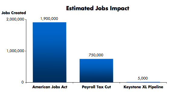
Update: Found: Tax cuts jobs vs. jobs act jobs created graph (below)
— Original Post —-
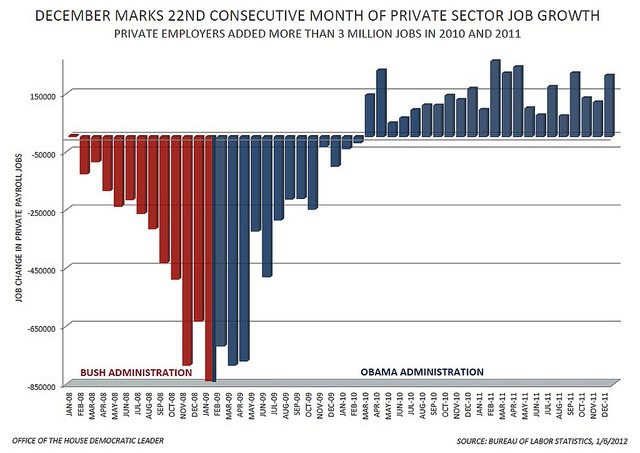
We’ve all seen the job growth graph: Bush vs. Obama, but what about a graph to show how many jobs get created by tax cuts vs. government spending to create jobs?
For decades Republicans claim tax cuts will result in jobs. Please show me how many. Show me proof. And then lets compare that to if we pass a jobs bill (obviously not the entire jobs bill since that already went down… and the teachers and firefighters lost, too… infrastructure certainly next to not make it through the Senate next)…. how many jobs will those ventures create? How much net money with either option are we talking actually running through the US economy as a result? Which gets more money moving (and hence… back to all the big companies but at least it’s moving again, right? Clearly I’m no economist. ;) ).
Please, someone! Show me a graph. MSNBC? CNN? Heck, even Fox, go for it! Rachel Maddow, you like graphs, too, right? A Pie chart. A bar graph, I don’t care: Tax cut job creation vs. jobs bill job creation and the net money involved or “spent” by the government (whether in lost tax revenue or invested in job creation) to get the actual jobs.
Show me the jobs graph.
Tax Cuts jobs creation vs. American Jobs Act Jobs Creation:
Job growth under Republicans vs. President Obama:
“The Bikini Graph”
